You can learn a lot about someone on Twitter. Not only through tweets, but also through whom one follows.
For example, I joined Twitter in August 2009. I’m not sure why–few of my friends were on the platform, it hadn’t been fully embraced by sports media, and there were no good memes. Maybe out of morbid curiosity. At the time, I had three interests: sports, religious studies, and journalism. Fast forward a few years and I was into R, statistics, and data science. And then a few years later, JavaScript, and most recently, GIS technology. Skimming through the 717 accounts I follow in reverse order will reflect this chronology.
Thus, I hypothesized three loose “phases” of my Twitter existence: pre-computer programming, computer programming, and GIS/politics.1 Could these phases be visualized?
My plan was this: (1) extract the profile descriptions from each of the (admittedly excessive) 717 accounts I follow; (2) categorize them; and (3) produce a visualization illustrating (or debunking) my three hypothesized phases.
Getting data from Twitter means rtweet:2
library(tidyverse)

following <- rtweet::get_friends("daranzolin")
following <- rtweet::lookup_users(following$user_id)
following %>%
  select(user_id, screen_name, name, description) %>%
  mutate(follow_order = rev(row_number())) %>%
  mutate(follow_order_group = ceiling(follow_order / 50)) -> followed_accts
The follow_order column is the chronological order I followed the accounts. Where ‘follow_order = 1’,
that is the first account I ever followed, and where ‘follow_order = 717’ is the more recent account I’ve
followed.3 I created the follow_order_group variable to bin the accounts into roughly 15 groups (geom_dotplot
and geom_area were not cooperating with ‘binwidth = 1’).
Cateogorizing the descriptions is a slippery affair. My crude method was to assign terms to each category and sum the frequency of each term within a description. If there are more ‘R terms’ than ‘sports terms’ within a description, then that profile gets labeled ‘R’. One problem is that there is tons of overlap between R, JS,and GIS users. A second is that the most common words such as ‘software’, ‘dataviz’, ‘science’ and ‘programmer’ resist labels. I tried to do my best with the key words below:
js_terms <- "js|javascript|react|d3|software"
r_terms <- "rstats|data|analy|statistics"
gis_terms <- "esri|cartography|geog|map|satellite|spatial|qgis|imagery"
sports_terms <- "sports|bball|basketball|hoop|nba|ball|athlete|player"
politics_terms <- "news|politic|current|events|journalist|investigative|activist|campaign"
religion_terms <- "religion|theolog|church|philosophy|christian|greek|testament|seminary|press|publishing"
The categorization code:
sg <- function(x, term) sum(grepl(term, x, ignore.case = TRUE))

followed_accts$category <- map_chr(followed_accts$description, function(x) {
  words <- strsplit(x, " ")[[1]]
  v <- tibble(
    JavaScript = sg(words, js_terms),
    R = sg(words, r_terms),
    GIS = sg(words, gis_terms),
    Religion = sg(words, religion_terms),
    Politics = sg(words, politics_terms),
    Sports = sg(words, sports_terms)
   ) %>%
  gather(g, value) %>%
  top_n(1) %>%
  pull(g)
  if (length(v) == 6) return("Unknown")
  else if (length(v) > 1) return(v[1])
  else return(v)
})
The visualization code:
followed_accts %>%
  mutate(category = factor(category, levels = c("Sports", "Religion", "Politics", "R", "JavaScript", "GIS"))) %>%
  filter(category != "Unknown") %>%
  count(follow_order_group, category) %>%
  add_row(follow_order_group = c(2,3), category = "JavaScript", n = 0) %>%
  add_row(follow_order_group = c(1,2,3), category = "R", n = 0) %>%
  add_row(follow_order_group = c(1,3,4,6,7,9,11), category = "GIS", n = 0) %>%
  add_row(follow_order_group = c(5,7,8, 11, 12, 15), category = "Religion", n = 0) %>%
  add_row(follow_order_group = c(8,15), category = "Politics", n = 0) %>%
  add_row(follow_order_group = 15, category = "Sports", n = 0) %>%
  ggplot(aes(x = follow_order_group, y = n, fill = category)) +
  geom_area(position = "fill") +
  geom_vline(xintercept = c(3,11), linetype = "dashed") +
  annotate("text", x = 2, y = 0.5, label = "Grad \nSchool") +
  annotate("text", x = 5, y = 0.3, label = "#rstats") +
  annotate("text", x = 7.5, y = 0.10, label = "#d3js") +
  annotate("text", x = 13.5, y = 0.05, label = "#GIStribe") +
  annotate("text", x = 12, y = 0.80, label = "#resist") +
  labs(x = "",
       title = "A Brief History of Twitter",
       subtitle = "Tracking Interests through Accounts Followed, 2009-2018",
       fill = "") +
  scale_y_continuous(NULL, breaks = NULL) +
  scale_x_continuous(breaks = 1:15, labels = c("August 2009", rep("", 13), "October 2018")) +
  scale_fill_brewer(palette = "Pastel2") +
  theme(panel.grid.major = element_blank(),
        panel.grid.minor = element_blank(),
        panel.background = element_blank(),
        legend.position = "top")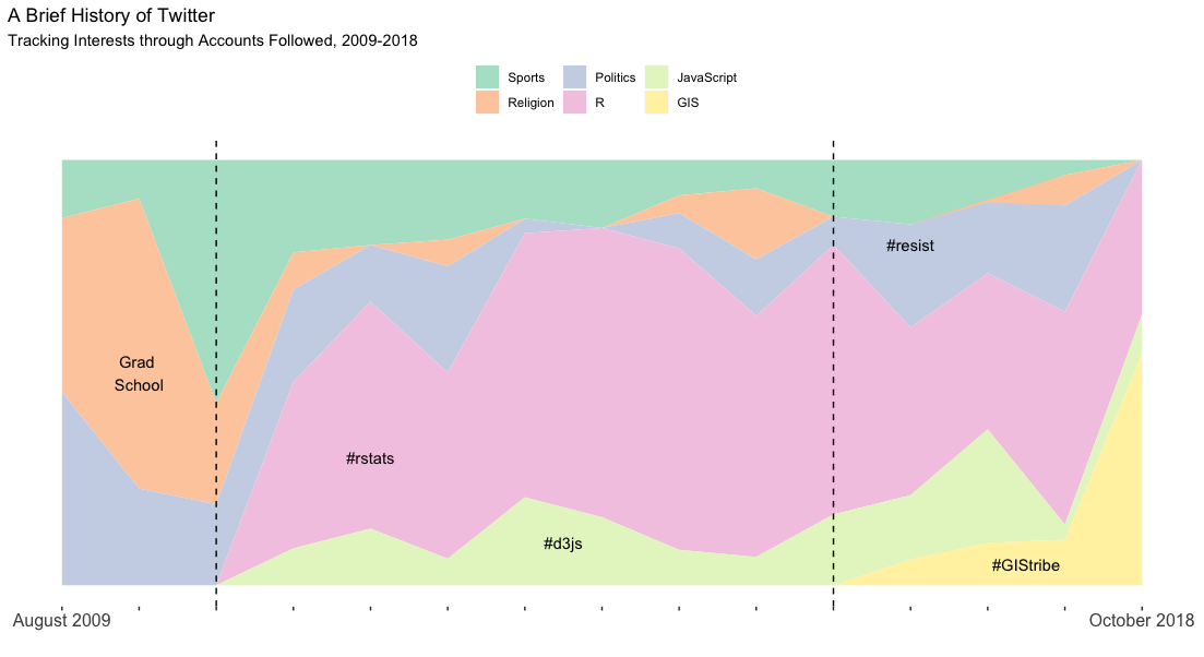
I think it checks out! The small uptick in news/politics accounts probably coincides with the 2016 election, my timeline is still dominated by #rstats, and there is a visible emergence of GIS accounts. I wonder what Phase 4 will be…