Biologists tell us our eyes evolved to seize upon movement. This evolutionary quirk, once the difference between death by sabertooth and another night in a cave, is now exploited by marketing professionals, entertainers, and most recently, data analysts. But animation in the data visualization space–while always fun–is sometimes gratuitous. Do these points need to move? Does that bar need to grow? These are questions asked by smart visualization professionals.
Movement and animation have epistemological, archetypal, and value-laden dimensions: ascent = good; descent = bad; lateral movement implies distance, time, etc. For example, consider the Pudding’s recent visualization of high school stars’ NBA destinies. The result is brilliant, compelling, and incredibly well-done in just about every way. I do, however, think it slightly odd that in this particular example, the further down an observation travels, the better their career. There is maybe some momentary mental friction as the viewer must re-orient their ‘down = bad’ bias. Of course, the viz is smartly decorated with labels and shadings to assist with this re-orientation, but I maintain that it exists. Scroll down the page, and note that the “down = ‘bad’” perspective returns in the funnel charts; colleges with more NBA players have longer bars up high.1
The Pudding’s project was my inspiration and motivation for d3rain, my latest package. At it’s core, the package is a fun way to
visualize distibutions, and the downward movement can reinforce various subtleties within the subject. The example below shows the distribution of 2015 police killings by ‘armed status’.
library(dplyr)
library(d3rain)

armed_levels <- rev(c('Unarmed', 'Knife', 'Non-lethal firearm', 'Firearm'))
pk <- fivethirtyeight::police_killings %>%
  mutate(armed = recode(armed, No = "Unarmed")) %>%
  mutate(armed = factor(armed, levels = armed_levels)) %>%
  filter(armed %in% armed_levels,
         !is.na(age))
pk %>%
  arrange(age) %>%
  d3rain(age, armed, toolTip = age, title = "2015 Police Killings by Age, Armed Status") %>%
  drip_settings(dripSequence = 'iterate',
                ease = 'linear',
                jitterWidth = 25,
                dripSpeed = 500,
                dripFill = 'firebrick',
                iterationSpeedX = 20) %>%
  chart_settings(fontFamily = 'times',
yAxisTickLocation = 'left') 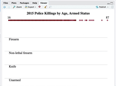
While almost no police killings are justified and all are tragedies, contra the Pudding’s example, here descent is worse by varrying degrees. The dropping movement may also evoke ‘bodies dropping’, and the crimson red is a clear analog to bloodshed. A black fill would also be appropriately somber. But ultimately because of the movement, I think that this chart ‘hits harder’ than a box plot or histogram.
-
I would also contest their suspect evaluation of certain players’ careers. Jamario Moon as ‘Great’? Tayshaun Prince a ‘Superstar’? Eric Gordan as ‘Mediocre’? ↩