Getting this off before the new year! :flex:
Someone on Twitter creates nifty radar charts for Premier League soccer players. The radars indicate pass direction and frequency via longer and brighter areas. I wish I could link to an example, but the technique can be adapted for other spatial analyses. Namely, a simplified alternative to heatmaps and chloropleths.
The Camp Fire in Paradise affected many friends and family. I’ve drawn blogging inspiration from this tragedy before, but now with a more incisive, albeit similar spatial question: if I live in Paradise, from which direction are fires most commonly reported? North? East? Southwest? Code and radar charts below.
The data for this project is from BuzzFeed’s GitHub repo on wildfires.
First, I load my packages and the data:
library(vroom)
library(tidyverse)
library(sf)
library(mapview)
library(tmap)

fire_files <- dir("data/us_fires", full.names = TRUE)
fires <- vroom(fire_files,
               delim = ",",
               col_select = c("discovery_date",
                              "fire_year",
                              "stat_cause_descr",
                              "latitude",
                              "longitude",
                              "state",
                              "fips_name"))
Second, I subset and transform the fires from Butte County:
butte_fires <- fires %>%
  filter(
    fips_name == "Butte",
    state == "CA",
    fire_year %in% 2006:2015
  ) %>%
  st_as_sf(crs = 4326, coords = c("longitude", "latitude")) %>%
  st_transform(3488) # NAD83(NSRS2007) / California Albers
Third, I needed a way to partition a circle into “pizza slices”. I asked on StackOverflow and Barry Rowlingson came to my rescue with some trig. His solution was two functions, one to create a single wedge given a centre, radius, start angle, width, and number of sections in the arc part, and another to create separate wedges with different start angles. Clever!
st_wedge <- function(x,y,r,start,width,n=20){
    theta = seq(start, start+width, length=n)
    xarc = x + r*sin(theta)
    yarc = y + r*cos(theta)
    xc = c(x, xarc, x)
    yc = c(y, yarc, y)
    st_polygon(list(cbind(xc,yc)))
}

st_wedges <- function(x, y, r, nsegs){
    width = (2*pi)/nsegs
    starts = (1:nsegs)*width
    polys = lapply(starts, function(s){st_wedge(x,y,r,s,width)})
    mpoly = st_cast(do.call(st_sfc, polys), "MULTIPOLYGON")
    mpoly
}
Now, fourth, I create, project, and total the fires by wedge:
n_wedges <- 16
wedges <- st_wedges(-121.621, 39.759, 0.4, n_wedges) %>%
  st_as_sf() %>%
  st_set_crs(4326) %>%
  st_transform(3488)

wedges$fires <- lengths(st_intersects(wedges, butte_fires))
mapview(wedges, alpha.regions = 0.25, zcol = "fires")
Here’s what we have:
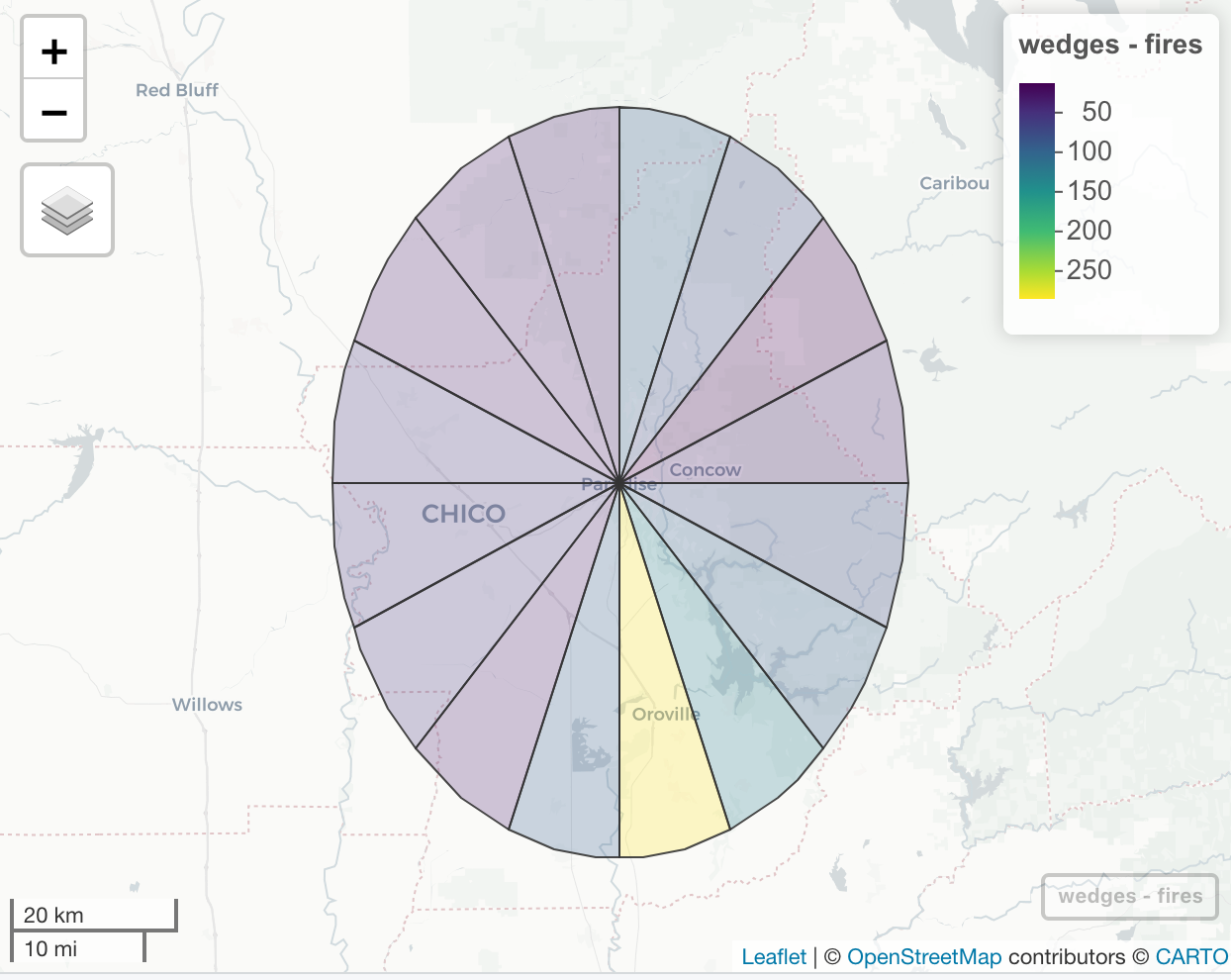
Note that the slices have been somewhat distorted from the projection. But it looks like most fires are from the southeast zone. But has that always been the case? Our data only goes to 2015, but let’s check 10 years.
butte_fires_by_year <- butte_fires %>% split(.$fire_year)
wedges_by_year <- wedges %>% rep(length(butte_fires_by_year))

wedges_by_year <- map2(wedges_by_year, butte_fires_by_year, ~{
  out <- st_as_sf(.x)
  out$fires <- lengths(st_intersects(out, .y))
  out
})
And because donut charts are more pleasing to the eye, let’s hollow out the center:
paradise <- st_as_sf(data.frame(longitude = -121.621, latitude = 39.759),
                     crs = 4326,
                     coords = c("longitude", "latitude")) %>%
  st_transform(3488)
paradise_buff <- st_buffer(paradise, dist = 20000)
donut <- st_difference(wedges, paradise_buff)
At this point I started fiddling with maps using ggplot2, leaflet, and tmap. tmap won out, but I needed to get each year into a separate column. Look away, tidyversers–it is a for loop:
colname_years <- as.character(2006:2015)
for (i in seq_along(colname_years)) {
  donut[[colname_years[i]]] <- wedges_by_year[[i]]$fires
}
And the final viz:
tm_shape(donut) +
  tm_fill(
    colname_years,
    title = "Fires",
    breaks = c(0, 1, 5, 10, 30, 40, 50, 90)
  ) +
  tm_compass(
    type = "4star",
    size = 1.5,
    position = c("center", "center"),
    show.labels = 2
  ) +
  tm_facets(nrow = 2) +
  tm_layout(
    main.title = "Fire Zones around Paradise, 2006-2015\n ",
    legend.outside = TRUE,
    legend.position = c("left", "top"),
    legend.text.size = 1,
    legend.hist.size = 1,
    legend.width = 5,
    panel.labels = colname_years,
    panel.label.size = 1.5
  )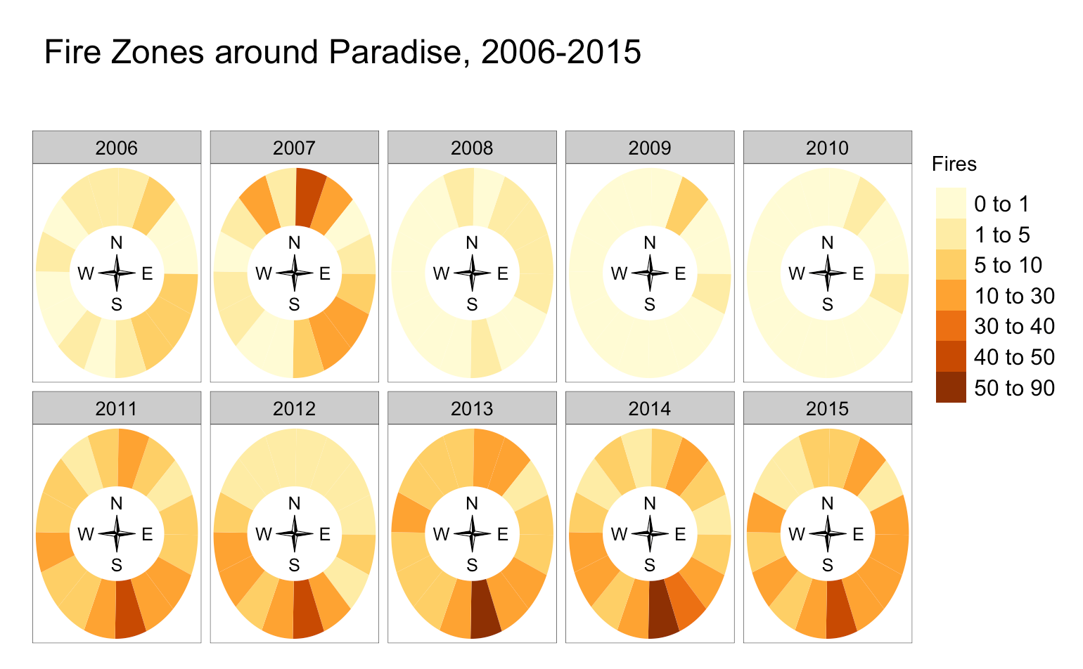
Downtown Paradise is at the center of each radar chart. And the southeast holds–most fires from that zone.
A heatmap would admittedly be more precise (and possibly easier to make), but I like the generalized simplicity for the zones. I think it’s more effective at a glance and indicates change over time quicker.
This may be bundled into a package at a later date.