The New York Times recently did an incredible feature on the first 12 hours of the devastating ‘Camp Fire.’ Less than 12 hours after the fire started, they reported, the fire had traveled 17 miles and burned 55000 acres. Can you picture 55000 acres? 17 miles is no problem, but 55000 acres? It’s an almost meaningless number to most Americans, signifying nothing beyond “a lot”.
We struggle with areas for three reasons. First, we probably don’t know the formulas for conversion. Second, even if we did know that 1 square mile is 640 acres, math is hard. And third, area is more abstract than distance and thus more difficult to conceptualize. This is the same reason bar charts are superior to pie charts.
As an aspiring GIS professional, improving my spatial faculties is on the to-do list. Towards that end, I developed a small
tool to map and compare areas within a familiar location. compareAreas is a Shiny Gadget that can be used as a handy reference. Unsure what’s larger–55000 acre or 100 square miles? Plug it in:
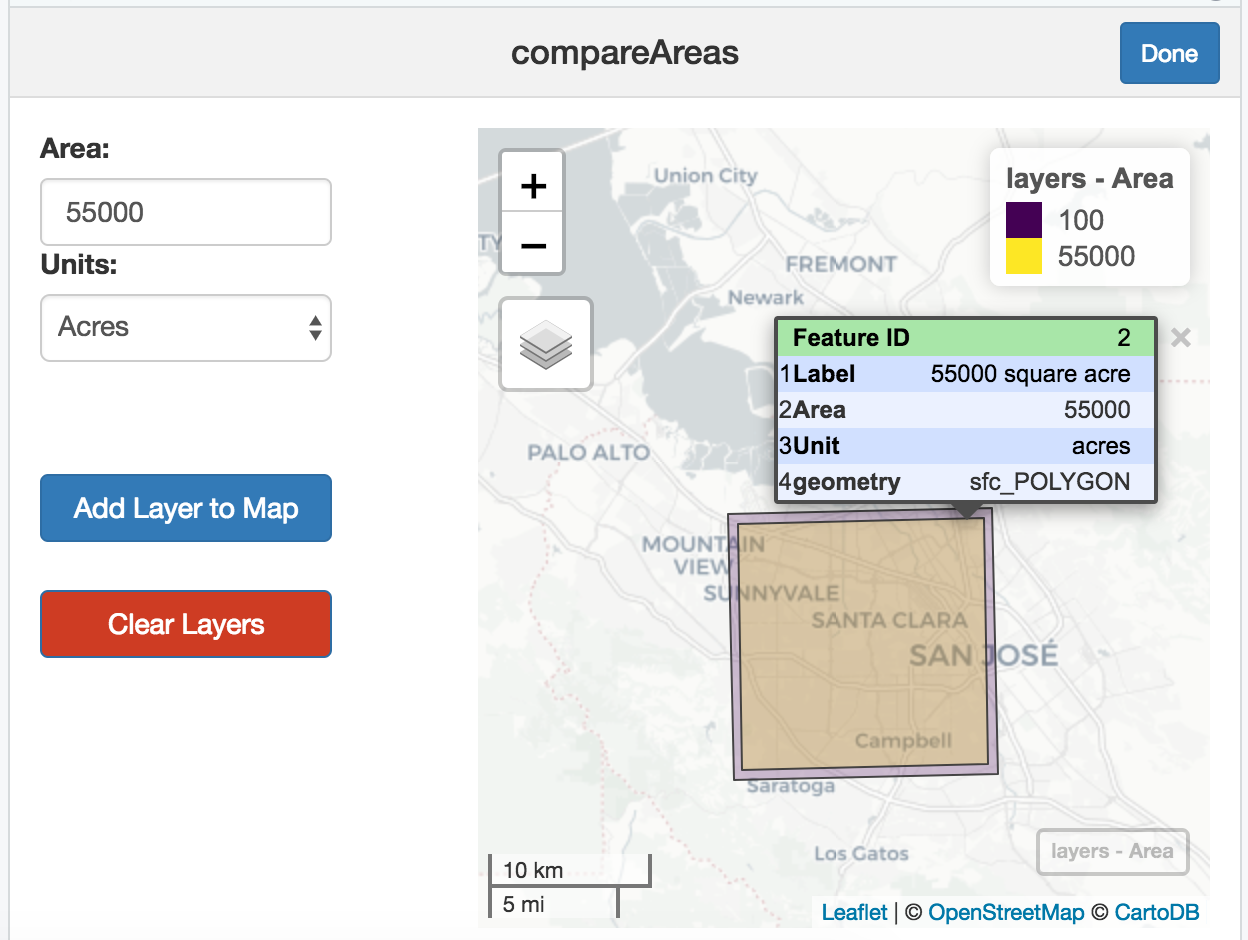
The tool is unapologetically bay-area-centric. Working out the projections for custom locations was beyond my time and interest, but any urban area with roads, parks, and freeways is a stable reference for area comparison.