This post is about pre-exploratory data analysis. Namely, answering questions about the data at two junctures: before you know anything about the data and when you know only very little about the data. There are roughly three overlapping questions to ask:
- What is this?
- What’s in this?
- What can I do with this?
I toyed with three poetic conceits for the post. I first tried to pair Antonio Machado’s wanderer with an eager data analyst. “…caminante, no hay camino, se hace camino al andar”, he muses.1 But after further reflection on the nature of data exploration, and a scolding by a native speaker who disputed my interpretation, I abandoned the connection. Second, I tried to shoehorn “The Road Not Taken” by Robert Frost into a narrative about exploratory data analysis. But the association collapses in the first stanza: data analysts can travel both roads; there is no one way to do this thing. Finally, I arrived where I should have started, with Tolkien’s majestic “All That is Gold Does Not Glitter”. Like Aragorn, the true King of Gondor, data analysts may wander but are not lost. This post is for data analysts ready to wander over their data (with R).
For the remainder of this post, I’ll be wandering through suspension data from my rCAEDDATA package. The data set includes suspension counts, cumulative enrollment, and suspension rate data from the California Department of Education.
library(rCAEDDATA) #devtools::install_github("daranzolin/rCAEDDATA")
library(tidyverse)
data("suspensions")
What is this?
We have some data. What is it? If you’re not sure, use the class function:
class(suspensions)[1] "tbl_df" "tbl" "data.frame"
Since it’s a data frame, we’re in good shape. Parsing lists, JSON, XML, or other objects into tables takes time and effort and is far beyond the scope of this post.
There are several functions commonly used to inspect objects, but my first two are always glimpse and View.
View(supsensions)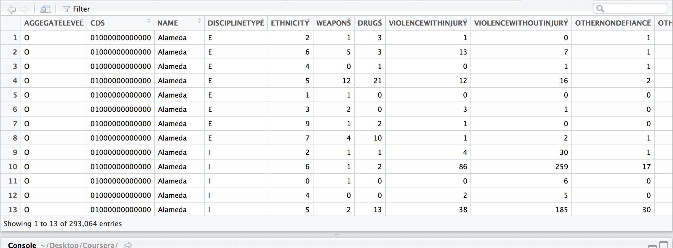
View helps me visualize future transformations as data gets sliced, sorted, grouped, and gathered. It’s like a map my
mind can move over as I consider variations and covariations within the data.
glimpse(suspensions)
Observations: 293,064
Variables: 15
$ AGGEGATELEVEL         <chr> "O", "O", "O", "O", "O", "O", "O", "O", "O", "O", "O", "O", "O", "O", "O", "O", "O", "O", "O", "O", "O", "O...
$ CDS                   <chr> "01000000000000", "01000000000000", "01000000000000", "01000000000000", "01000000000000", "01000000000000",...
$ NAME                  <chr> "Alameda", "Alameda", "Alameda", "Alameda", "Alameda", "Alameda", "Alameda", "Alameda", "Alameda", "Alameda...
$ DISCIPLINETYPE        <chr> "E", "E", "E", "E", "E", "E", "E", "E", "I", "I", "I", "I", "I", "I", "I", "I", "I", "O", "O", "O", "O", "O...
$ ETHNICITY             <int> 2, 6, 4, 5, 1, 3, 9, 7, 2, 6, 0, 4, 5, 1, 3, 9, 7, 2, 6, 0, 4, 5, 1, 3, 9, 7, 7, 2, 0, 5, 1, 3, 9, 7, 2, 0,...
$ WEAPONS               <int> 1, 5, 0, 12, 1, 2, 1, 4, 1, 1, 1, 0, 2, 0, 0, 1, 1, 19, 80, 4, 18, 150, 1, 2, 18, 41, 0, 0, 0, 0, 0, 0, 0, ...
$ DRUGS                 <int> 3, 3, 1, 21, 0, 0, 2, 10, 1, 2, 0, 0, 13, 0, 0, 0, 3, 82, 284, 6, 50, 667, 11, 16, 38, 200, 0, 0, 0, 0, 0, ...
$ VIOLENCEWITHINJURY    <int> 1, 13, 0, 12, 0, 3, 1, 1, 4, 86, 0, 2, 38, 0, 1, 11, 13, 83, 773, 20, 27, 458, 12, 26, 72, 133, 0, 0, 0, 2,...
$ VIOLENCEWITHOUTINJURY <int> 0, 7, 1, 16, 0, 1, 0, 2, 30, 259, 6, 5, 185, 3, 7, 34, 58, 205, 1802, 50, 75, 1531, 14, 72, 153, 496, 1, 1,...
$ OTHERNONDEFIANCE      <int> 1, 1, 1, 2, 0, 0, 0, 1, 1, 17, 0, 0, 30, 1, 0, 3, 11, 28, 221, 6, 14, 243, 3, 23, 22, 83, 0, 0, 0, 5, 1, 0,...
$ OTHERDEFIANCE         <int> 0, 3, 0, 0, 0, 0, 0, 0, 34, 271, 1, 23, 256, 2, 6, 34, 75, 116, 878, 13, 49, 1044, 16, 48, 67, 295, 0, 0, 2...
$ TOTAL                 <int> 6, 32, 3, 63, 1, 6, 4, 18, 71, 636, 8, 30, 524, 6, 14, 83, 161, 533, 4038, 99, 233, 4093, 57, 187, 370, 124...
$ YEAR                  <fctr> 2014-15, 2014-15, 2014-15, 2014-15, 2014-15, 2014-15, 2014-15, 2014-15, 2014-15, 2014-15, 2014-15, 2014-15...
$ DATECREATED           <chr> "12/21/2015 12:00:00 AM", "12/21/2015 12:00:00 AM", "12/21/2015 12:00:00 AM", "12/21/2015 12:00:00 AM", "12...
$ DATEUPDATED           <chr> "12/21/2015 12:00:00 AM", "12/21/2015 12:00:00 AM", "12/21/2015 12:00:00 AM", "12/21/2015 12:00:00 AM", "12...
glimpse gives me a snapshot of the variable names, types, and the first few values. Here are three initial obervations:
- I’ll need to consult the DoE’s codebook to identify the various
AGGREGATELEVELandDISCIPLINETYPE. - If I want to work with the
DATECREATEDandDATEUPDATEDvariables, I’ll have to work those columns into proper dates. - The data is not tidy:
DISCIPLINETYPE:OTHERDEFIANCEshould be tidied into a single variable.
What’s in this?
Another tool used by experienced wanderers is the visdat package. visdat helps us “see” the data in color by
displaying the variable classes and missing values in a data frame as plots. If View offers a map of the topography, glimpse provides a map of the climate.
library(patchwork)
library(visdat)
p1 <- vis_dat(suspensions, warn_large_data = FALSE)
p2 <- vis_miss(suspensions, warn_large_data = FALSE)
p1 + p2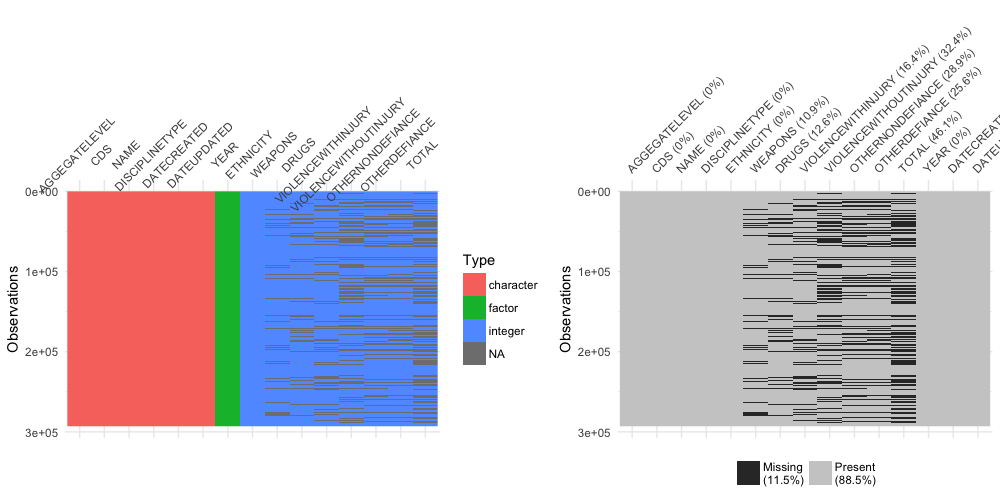
What can I do with this?
With a lay of the land, the wanderer analyst is now ready to start asking questions. Are drugs-related suspensions increasing or decreasing? In what counties, districts, or schools are there the least suspensions? Numerous charts and maps might be springing into your head, so let’s make some. As noted above, the data is not tidy, so a few transformations are required. I’ve decided to focus on county-level data, which correpsonds to the “O” aggregate level:
county_data <- suspensions %>%
  filter(AGGEGATELEVEL == "O") %>%
  select(-DATECREATED, -DATEUPDATED, -CDS, -AGGEGATELEVEL) %>%
  gather(suspension_reason, suspensions, WEAPONS:TOTAL) %>%
  janitor::clean_names()
Interlude: assertr
assertr is another important EDA tool. The package includes functions designed to verify assumptions about data. In the example below, I’m confirming that (1) Santa Clara, Alameda, and San Francisco counties appear in the data set; (2) no row has more than 1 NA; and (3) each row is unique. These functions are helpful when you have rigid expectations and requirements the data must satisfy.
invisible(
  county_data %>%
    verify(c("Alameda", "Santa Clara", "San Francisco") %in% .$name) %>%
    assert_rows(num_row_NAs, within_bounds(0,1), everything()) %>%
    assert_rows(col_concat, is_uniq, everything())
)
A violation of any assertion would throw an error.
EDA Visualizations
To the plots! Here’s the various suspensions over time:
county_data %>%
  filter(suspension_reason != "TOTAL") %>%
  group_by(year, suspension_reason) %>%
  summarize(suspensions = sum(suspensions)) %>%
  ggplot(aes(year, suspensions, color = suspension_reason)) +
  geom_point(size = 4) +
  geom_line(aes(group = suspension_reason)) +
  labs(x = "Year",
       y = "Suspensions",
       title = "Suspensions in California",
       subtitle = "2011-2015",
       caption = "Source: CA Department of Education",
       color = "Reason") +
  hrbrthemes::theme_ipsum()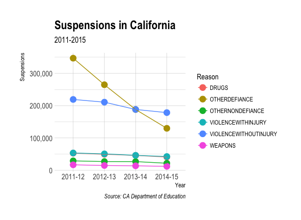
Observed: supensions marked “other defiance” have dropped dramatically.
While bar plots via ggplot2 are the speediest way to compare suspensions by county, I’ve been looking for an excuse
to make waffle plots via the waffle package:
library(waffle)

prepare_waffle_data <- function(county) {
  unlist(
    filter(county_data, name == county, suspension_reason != "TOTAL") %>%
    group_by(suspension_reason) %>%
    summarize(suspensions = sum(suspensions)) %>%
    ungroup() %>%
    select(suspension_reason, suspensions) %>%
    spread(suspension_reason, suspensions)
  )
}

iron(
  waffle(prepare_waffle_data("El Dorado")/100,
         rows = 5,
         legend_pos="none",
         size = 0.4,
         pad = 3,
         title = "El Dorado"),
  waffle(prepare_waffle_data("Mendocino")/100,
         rows = 5,
         legend_pos="none",
         size = 0.4,
         pad = 3,
         title = "Mendocino"),
  waffle(prepare_waffle_data("Yuba")/100,
       rows = 5,
       legend_pos="bottom",
       size = 0.4,
       pad = 3,
       title = "Yuba",
       xlab = "1 square = 100 students")
)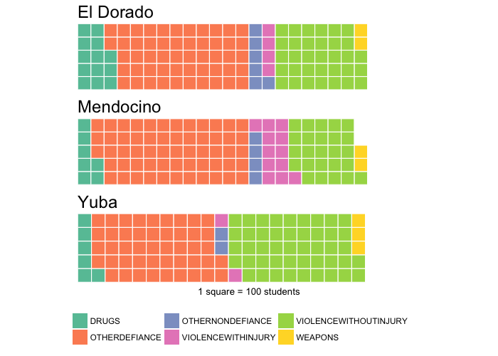
Observed: El Dorado has had more drugs-related suspensions, Mendocino has had more violence-with-injury suspensions, and Yuba has had more violence-without-injury suspensions.
Where are the largest proportions of drug-related suspensions?
library(ggmap)
library(mapdata)
states <- map_data("state")
ca_df <- subset(states, region == "california")
counties <- map_data("county")
ca_county <- subset(counties, region == "california")

drug_data <- suspensions %>%
  filter(YEAR == "2014-15",
         AGGEGATELEVEL == "O") %>%
  group_by(NAME) %>%
  summarize(TOTAL_DRUGS = sum(DRUGS, na.rm = TRUE),
            TOTAL = sum(TOTAL, na.rm = TRUE),
            DRUG_PROP = round(TOTAL_DRUGS/TOTAL, 2))

map_data <- left_join(ca_county, drug_data %>%
                        mutate(subregion = stringr::str_to_lower(NAME)),
                      by = "subregion")

ggplot(data = ca_df, mapping = aes(x = long, y = lat, group = group)) +
  coord_fixed(1.3) +
  geom_polygon(color = "black", fill = "gray") +
  geom_polygon(data = map_data, aes(fill = DRUG_PROP), color = "white") +
  geom_polygon(color = "black", fill = NA) +
  labs(title = "Proportion of Drugs-Related Suspensions by County, 2014-2015",
       fill = "Proportion") +
  theme_void() +
  viridis::scale_fill_viridis()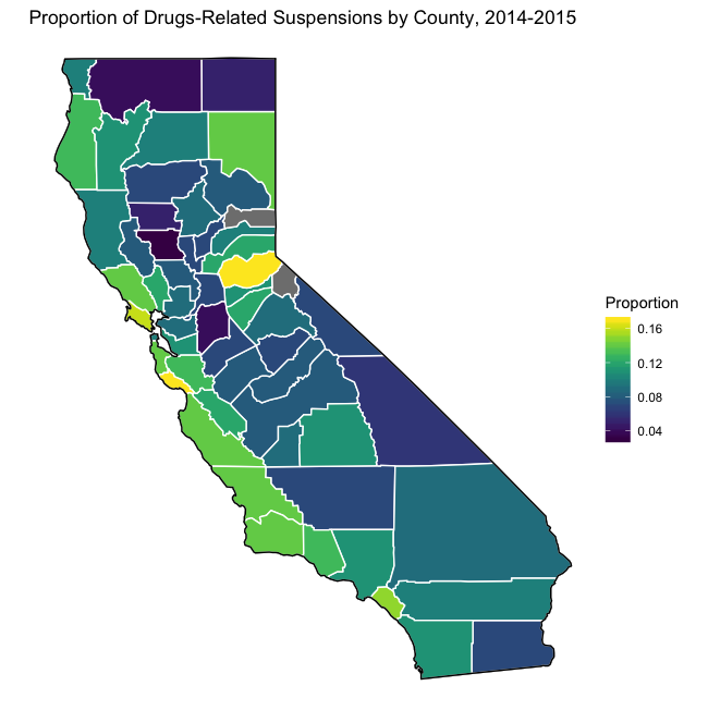
-
“…wanderer, there is no road, you make the road by walking” ↩