In data visualization, less is often more, and the best advice is almost always “simplify simplify”. When viewing a chart, the viewer’s attention should be immediately drawn to something worth emphasizing: an outlier, a contrast, a pattern, etc. The less elements on the page the better.
For example, consider the following charts:
library(tidyverse)
library(gapminder)
library(patchwork)

d <- gapminder %>%
  filter(continent %in% c("Americas", "Europe")) %>%
  group_by(continent, year) %>%
  summarize(pop = sum(pop))

p1 <- ggplot(d, aes(year, pop, fill = continent)) + geom_col()
p2 <- ggplot(d, aes(year, pop, fill = continent)) + geom_col(position = "dodge")

p1 + p2 + plot_layout(ncol = 1)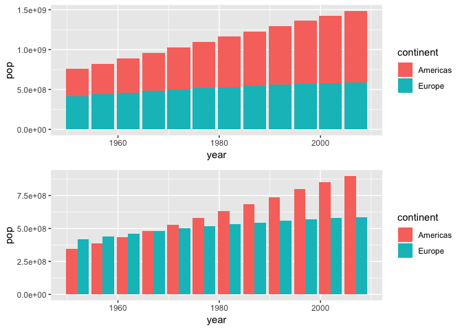
I ask you: when did the total population of the Americas exceed the total population of Europe? With the top chart, you’d guess sometime between 1960 and 1980, but it’s hard to tell at a glance. And while it’s easier to tell with the second plot, the clarity comes at the sake of clutter. The surplus of bars is messy and you have to use your imagination to fill in the blank space representing the difference in magnitude. I also find it annoying to squint and focus on individual pairs of bars. Not a great dataviz IMHO.
Mike Bostock recently produced a pleasing alternative that combines the two levels into a single bar and fills in the difference accordingly. I reproduced his work in R here, although reshaping the data required some tidyverse wizardry, 60+ lines of code, and a couple hours of my life. Wishing to abstract this plot behavior, I then solicited the RStudio community for the creation of a new ggplot Geom or Stat, and although John Lewis came close, neither of us conjured a solution. I still do not understand what compute_group really does within the ggplot framework.
And so, wishing to (1) create something cool; (2) better learn d3.js; and (3) increase my number of github stars share something with the community, I sat down to create a new htmlwidget, compareBars.1
compareBars, I think, offers a cleaner alternative:
library(compareBars)
d %>%
  spread(continent, pop) %>%
  mutate(year = factor(year)) %>%
  compareBars(year, Americas, Europe)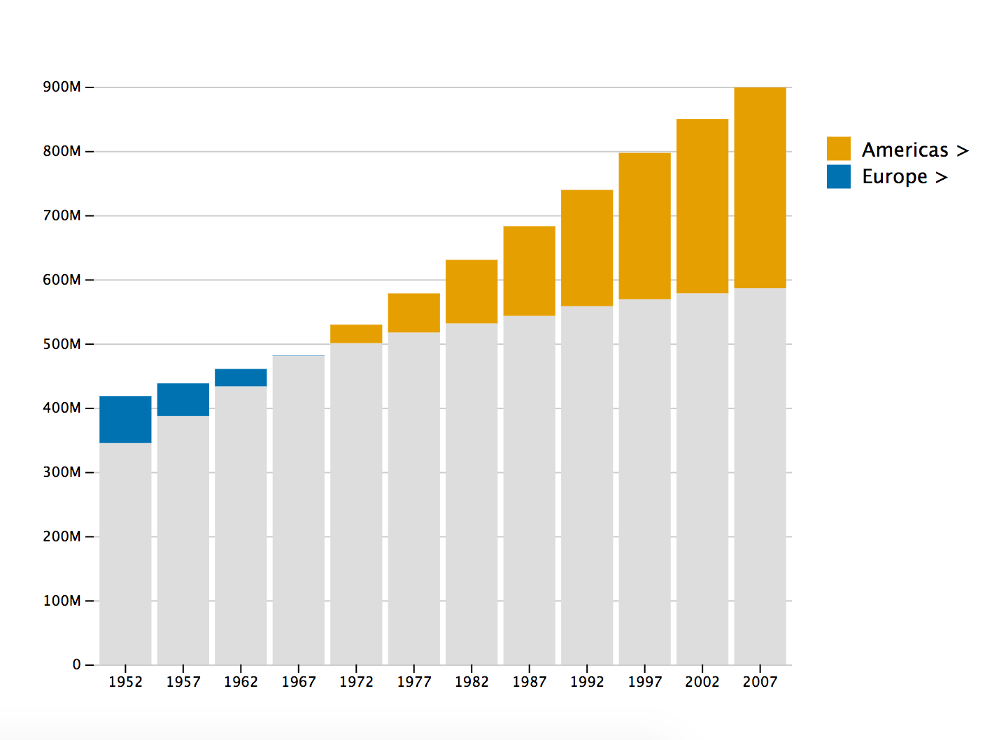
Not only is the moment when the Americas’ population exceeded Europe’s immediately clear, but you also get a much better sense of the difference in magnitude by year. A cleaner and more compelling visualization.
Check the README for additional customize options.
-
Shout out to Bob Rudis who made it ok to star your own projects. ↩