Mike Bostock is the Pontifex Maximus of data visualization. As a d3.js novice, I spend hours each week poring over his creations over at Observable HQ, a brilliant new medium to share compelling data visualizations and quantitative analysis. And because, as they say, imitation is the highest form of flattery, I’ve decided to reproduce some of his recent work in R (ggplot).
My interest in reproduction, however, goes beyond meer admiration. While I’ve enjoyed getting to know D3, I confess
it’s hard to struggle through the unfamiliar mechanics, knowing I could have produced a ggplot facsimile in a
fraction of the time. I tell myself it builds character. But at a programmatic level, I hope to catch a glimpse of what makes
these visualization paradigms unique and how easy it is to google their respective errors each tool might be leveraged
in the future. An ambitious goal to be sure.
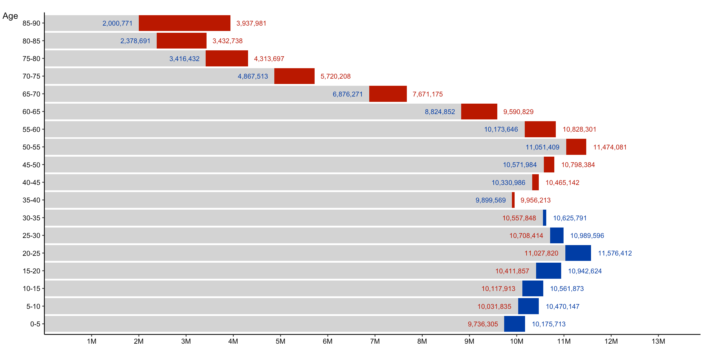
The visualization I’ve selected for reproduction is U.S. Population by Age and Sex.
What caught my attention was how the interelationship between three variables (Age, Gender, and Population) was visualized so
handsomely within one, two-dimensional space. It’s just a badass chart. All I knew to start was that
I would eventually and somehow use the fill option in ggplot. The rest was making the way by walking.
Getting the Data
The population data comes from the census API, and whipping up a function and interating through the variables was relatively straightforward.
library(httr)
library(tidyverse)
library(zeallot)

gender <- c(rep("M", 23), rep("F", 23))
ages <- c("0-5", "5-10", "10-15", "15-20", "15-20", "20-25","20-25", "20-25", "25-30", "30-35",
          "35-40", "40-45", "45-50", "50-55", "55-60", "60-65", "60-65", "65-70", "65-70", "70-75",
          "75-80", "80-85", "85-90")
ages2 <- c(ages, ages)
base_pre <- "B01001"
base_suf <- paste0("0", 03:49, "E")

# Look away tidyversers, it is a for loop:

for (i in seq_along(base_suf)) {
  if (nchar(base_suf[i]) == 3) base_suf[i] <- paste0("0", base_suf[i])
}

base_vars <- paste(base_pre, base_suf, sep = "_") %>% discard(~.=="B01001_026E")

urls <- sprintf("https://api.census.gov/data/2015/acs/acs5?get=%s&for=us", base_vars)

get_pop_estimate <- function(url) {
  Sys.sleep(2)
  est <- GET(url) %>%
    content("text") %>%
    jsonlite::fromJSON() %>%
    .[2,1] %>%
    as.numeric()
  cat(paste("Received population estimate for", url, "...\n"))
  return(est)
}

pop_estimates <- map(urls, get_pop_estimate)
pop_estimates <- flatten_dbl(pop_estimates)
In brief, I patched together the urls with the formatted variables, iterated through the urls, and pulled out the estimate value. The end goal was always a data frame, but I was still fuzzy on the desired tidyness and shape of the table. I don’t know what “version” this was, but I arrived at the following initial table:
df_1 <- tibble(
  gender = gender,
  age = ages2,
  estimate = pop_estimates
) %>%
  group_by(gender, age) %>%
  summarize(estimate = sum(estimate)) %>%
  ungroup() %>%
  spread(gender, estimate) %>%
  mutate(larger = if_else(`F` > `M`, "Larger female pop", "Larger male pop")) %>%
  gather(gender, estimate, `F`:`M`, -age, -larger)
There’s nothing like a little spreading and gathering to make you feel like a magician. Never gets old.
This next code was actually the penultimate block for me. My eventual solution to the estimate labels with different colors was to split the
earlier data into four tables and pass each one into geom_text. But “chronologically”, I guess, this comes next.
I had also recently watched a presentation on the zeallot package, and thought I could shoehorn a usage in here:
c(fdf, mdf) %<-% split(df_1, f = df_1$gender)

mdf_lower <- anti_join(mdf, filter(df_1, larger == "Larger male pop"))
mdf_higher <- anti_join(mdf, filter(df_1, larger == "Larger female pop"))
fdf_lower <- anti_join(fdf, filter(df_1, larger == "Larger female pop"))
fdf_higher <- anti_join(fdf, filter(df_1, larger == "Larger male pop"))
Confession: I do not believe some of what follows is essential to the final plot, but I lack the patience and courage to go back and change anything now. Here I was pondering how to scale the grey values in the original plot, but the solution jumped out after perusing Bostock’s original code.
Also, as an aside: there was some recent Twitter chatter about the rowwise() function as an ugly stepchild, and I’ve always wondered why I’m the only one who seems to use it. For me, a mutated value often doesn’t change down a column until I specify the rowwise function.
names(mdf) <- paste0("m_", names(mdf))
names(fdf) <- paste0("f_", names(fdf))

df_2 <- bind_cols(mdf, fdf) %>%
  rowwise() %>%
  mutate(larger = if_else(m_estimate > f_estimate, "Male", "Female"),
         total_est = m_estimate + f_estimate,
         min_pop_est = min(m_estimate, f_estimate)) %>%
  mutate(remainder_est = max(m_estimate, f_estimate) - min_pop_est)

df_3 <- df_2 %>%
  select(age = f_age, larger, min_pop_est, remainder_est) %>%
  gather(fill_col, value, min_pop_est:remainder_est, -age, -larger) %>%
  unite("fill_col", c("larger", "fill_col"), sep = "_") %>%
  mutate(fill_col = recode(
    fill_col,
    "Female_min_pop_est" = "min_pop_est",
    "Male_min_pop_est" = "min_pop_est")) %>%
  mutate(age = forcats::fct_relevel(age, "5-10", after = 1))
The end was in sight. I think at this point I’ve already exceeded the number of lines within Bostock’s code, so I’m not winning any points for brevity here. But feast your eyes on this ggplot call!
 ggplot(df_3, aes(age, value)) +
  geom_bar(stat = "identity", aes(fill = fill_col)) +
  geom_text(data = mdf_lower, aes(age, estimate, label = prettyNum(estimate, big.mark=",", preserve.width = "none")), size = 2.5, color = "#003da5", hjust = 1.2) +
  geom_text(data = mdf_higher, aes(age, estimate, label = prettyNum(estimate, big.mark=",", preserve.width = "none")), size = 2.5, color = "#003da5", hjust = -0.2) +
  geom_text(data = fdf_lower, aes(age, estimate, label = prettyNum(estimate, big.mark=",", preserve.width = "none")), size = 2.5, color = "#ba0000", hjust = 1.2) +
  geom_text(data = fdf_higher, aes(age, estimate, label = prettyNum(estimate, big.mark=",", preserve.width = "none")), size = 2.5, color = "#ba0000", hjust = -0.2) +
  labs(y = "",
       x = "Age") +
  coord_flip() +
  scale_y_continuous(
    breaks = seq(1e6, 13e6, by = 1e6),
    labels = paste0(1:13, "M"),
    expand = expand_scale(mult = c(0,0.2))
  ) +
  scale_fill_manual(values = c("#ba0000", "#003da5", "#D3D3D3")) +
  theme_classic() +
  theme(legend.position = "none") +
  theme(axis.title.y = element_text(hjust = 1, angle = 0)) +
  theme(plot.margin = unit(c(1, 2, 1.5, 1.2), "cm"))
How’d I do? You decide. A brief explanation:
This chart compares the estimated female and male populations by age in the United States as of 2015. For each age bracket, red represents a larger female population, blue represents a larger male population, and gray represents the smaller of the two. The total estimated population is 316,515,021.
Me and R and ggplot:
Bostock and JS and d3.js
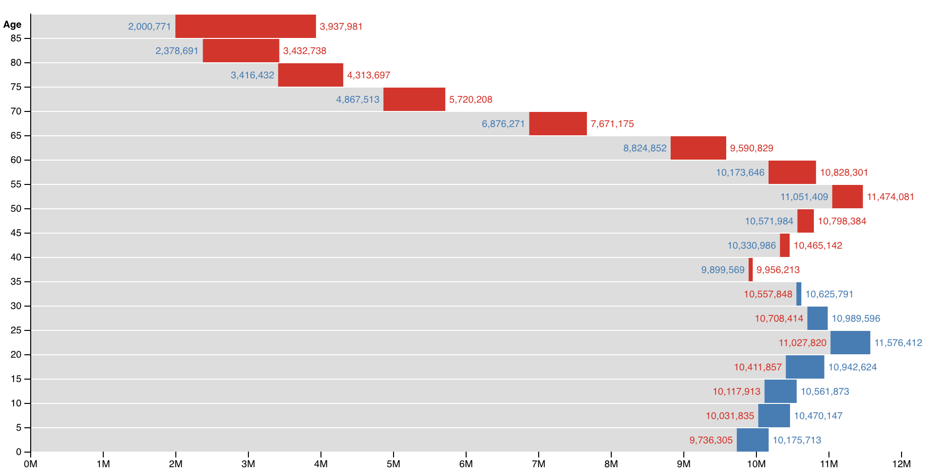
My colors are a little off, I didn’t push the ‘Age’ axis title above the ticks, and nor did I try mirror Bostock’s age axis ticks. But besides those three minor details, I think it’s a faithful imitation!
Now for the reverse: to reproduce a ggplot in D3…